Confidence and prediction intervals explained... (with a Shiny app!)
This semester I started teaching introduction to statistics and data analysis with R, at Tel-Aviv university.
I put in a lot of efforts into bringing practical challenges, examples from real life, and a lot of demonstrations of statistical theory with R. This post is an example for how I’ve been using R code (and specifically Shiny apps) to demonstrate statistical theory, concepts and provide intuition.
What’s the difference between confidence and prediction intervals?
Last week I taught multiple linear regression, and I noticed that students have a hard time comprehending the difference between confidence intervals and prediction intervals. The former being an interval for the model (i.e., interval for the underlying model), and the latter being an interval for a noval observation.
As the sample size increases, our uncertainty of the model’s parameters decreases, but the uncertainty in the value of a new observation, \(y_0\) is associated with variance of \(Y\) (the random variable from which \(y_0\) is drawn). Hence, it has a lower bound, based on that variance.
In R, you can get a prediction or a confidence interval by using either
predict(object, newdata, interval = "prediction")
Or
predict(object, newdata, interval = "confidence")
For a prediction or for a confidence interval, respectively.
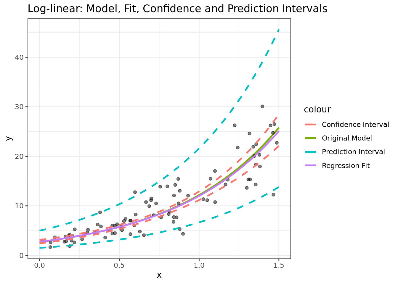
To help me illustrate the differences between the two, I decided to build a small Shiny web app. It shows the differences between confidence intervals, prediction intervals, the regression fit, and the actual (original) model.
The app is available here, and the source code is available on github.
With this app you can choose three types of models to demonstrate. Simple linear regression, and regression with a twist (\(\log\) transformation on the \(y\) or \(\sin\) transformation on the \(x\):
Linear model \(y = a + bx + \epsilon\)
Log-linear model \(\log(y)=a+bx+\epsilon\)
Sine \(y = a + b\sin(x) + \epsilon\)
All the models are based on simple linear regression (lm function), for the latter two models with either a log or sin transformation.
The app allows you to play around with various values such as the \(x\) range, the model’s parameters (\(a\) and \(b\)), the error’s standard deviation (\(\epsilon\)), and show or hide any of the following elements, on the chart:
The original function (i.e., the original model)
The sampled points
The confidence interval
The prediction interval
The model’s fit
Feel free to share the app or the app’s code. As mentioned above, the source code for the app is available here: https://github.com/adisarid/prediction_confidence_intervals_demo.
Here’s an example for what the app’s generating code and output looks like, for a model of the type \(\log(y) = 1 + \frac{x}{2} + \epsilon\):
library(dplyr)
library(tidyr)
library(tibble)
library(ggplot2)

sample_size <- 90
x_range <- c(0, 1.5)
a <- 1
b <- 1.5
sigma <- 0.3

actual_function <- tibble(x = seq(x_range[1], x_range[2], by = 0.01)) %>%
  mutate(actual_y = exp(a + b*x))

random_sample <- tibble(epsilon_err = rnorm(n = sample_size,
                                            mean = 0,
                                            sd = sigma),
                        x = runif(n = sample_size,
                                  min = x_range[1],
                                  max = x_range[2])) %>%
  mutate(sampled_y = exp(a + b*x + epsilon_err))

linear_model <- lm(formula = log(sampled_y) ~ x, data = random_sample)

prediction_i <- predict(object = linear_model,
                         newdata = actual_function,
                         interval = "prediction") %>%
  as_tibble() %>%
  rename_at(vars(lwr,upr), ~paste0(., "_pi")) %>%
  mutate_all(exp)

confidence_i <- predict(object = linear_model,
                         newdata = actual_function,
                         interval = "confidence") %>%
  as_tibble() %>%
  rename_at(vars(lwr,upr), ~paste0(., "_ci")) %>%
  select(-fit) %>%
  mutate_all(exp)

intervals <- actual_function %>%
  bind_cols(prediction_i,
            confidence_i)

ggplot() +
  geom_line(data = actual_function, aes(x, actual_y, color = "Original Model"), size = 1) +
  geom_point(data = random_sample, aes(x, sampled_y), alpha = 0.5) +
  geom_line(data = intervals,
            aes(x, fit, color = "Regression Fit"), size = 1) +
  geom_line(data = intervals,
            aes(x, lwr_pi, color = "Prediction Interval"),
            linetype = 2, size = 1) +
  geom_line(data = intervals,
            aes(x, upr_pi, color = "Prediction Interval"),
            linetype = 2, size = 1) +
  geom_line(data = intervals,
            aes(x, lwr_ci, color = "Confidence Interval"),
            linetype = 2, size = 1) +
  geom_line(data = intervals,
            aes(x, upr_ci, color = "Confidence Interval"),
            linetype = 2, size = 1) +
  theme_bw() +
  xlab("x") +
  ylab("y") +
  ggtitle("Log-linear: Model, Fit, Confidence and Prediction Intervals")
Conclusions
Shiny apps are a great way to illustrate theoretical concepts, to provide intuition, and to let students experiment with parameters and see the outcomes. In this post I demonstrated how a Shiny app can be used to explain the concepts of a regression fit, confidence, and prediction intervals.
If you used Shiny for interesting educational demonstrations I’d love to hear about it! feel free to share in the comments or message me on twitter @SaridResearch.